Is Your Medical Website Mobile-Friendly? Why Practices Lose Patients to Poor Responsive Design
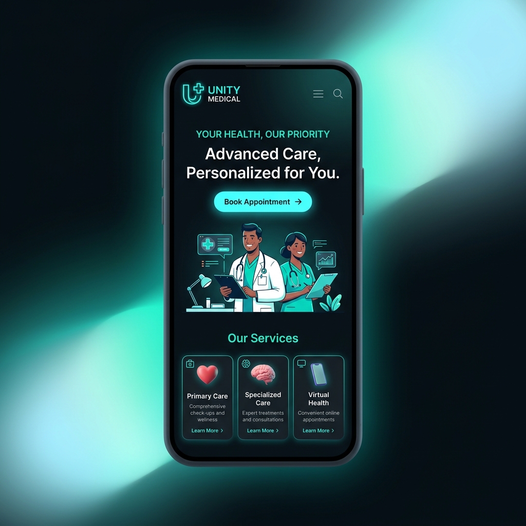
The majority of patients now begin their healthcare journey on a smartphone. They search for symptoms, read clinic reviews during lunch breaks, check directions while commuting, and book appointments from their couch at night. If your website does not deliver a seamless mobile experience, these potential patients will bounce to a competitor in seconds.
Google has used mobile-first indexing since 2019, meaning it primarily evaluates your site based on its mobile version. If your mobile experience is poor, your rankings suffer. But more importantly, patient behaviour is unforgiving — 53% of mobile users abandon a site that takes longer than three seconds to load.
Here are the most common mobile usability problems in medical websites and how to fix them.
Tiny tap targets. Phone screens are small, and fingers are imprecise. Buttons, links, and form fields must be at least 48x48 pixels with adequate spacing. If patients cannot easily tap your "Book Appointment" button without zooming in, you are losing bookings.
Slow load times are the number one mobile killer. Compress images, minimise JavaScript, and use a content delivery network (CDN). A one-second delay in page load time can reduce conversions by up to 20%. For a clinic website, every second counts when a patient is searching for urgent care.
Unreadable text without zooming. If a user has to pinch and zoom to read your content, they will leave. Use a base font size of at least 16px on mobile, with sufficient line height and contrast. Test your site on an actual phone, not just a browser's responsive mode.
Forms that are impossible to fill on a touchscreen. Minimise the number of fields, use large input areas, and enable autofill. Offer click-to-call as an alternative to form submission. A patient in pain does not want to type out a detailed message — they want to tap a button and speak to someone.
Navigation that is cluttered or hidden. On mobile, your navigation should be simple. Use a hamburger menu or a sticky bottom bar. Your phone number and booking CTA must be visible at all times as the user scrolls, not buried in a footer they may never reach.
Test your site regularly using Google's Mobile-Friendly Test tool and Search Console. Check your site on both iOS and Android devices. What looks perfect on an iPhone may be broken on a budget Android phone — and your patients use both.
A mobile-friendly website is no longer optional for healthcare practices. It is the minimum standard. Patients judge your professionalism by how well your site works on their phone. If it fails that test, they will never see your clinical expertise or compassionate care.