Why Mobile-First Design is Critical for Medical Websites
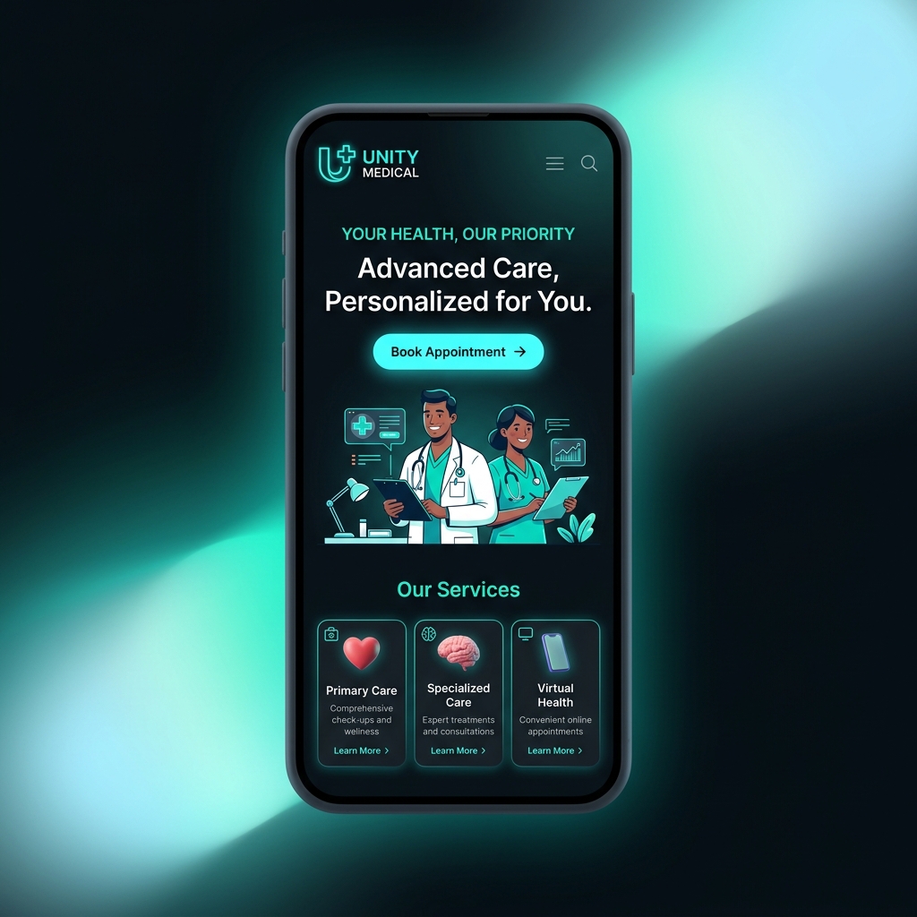
The majority of patients now find and evaluate healthcare providers on their phones. They search for "dentist near me" while on the go, read reviews during lunch breaks, and book appointments from their couches at night. If your website does not deliver a seamless mobile experience, these potential patients will move on to a competitor.
Mobile-first design means building your website for the smallest screen first, then scaling up to desktop. This approach forces you to prioritise what truly matters: clear navigation, fast loading times, and thumb-friendly buttons.
Page speed is especially critical on mobile. Google uses mobile page speed as a ranking factor, and patients expect a site to load in under three seconds. Compress images, minimise code, and use a reliable hosting provider to keep your site fast.
Navigation should be simple and intuitive on a small screen. Use a hamburger menu or a sticky bottom navigation bar. Your phone number and booking button should be visible at all times — not buried at the bottom of the page.
Forms must be easy to fill on a touchscreen. Use large input fields, minimised number of fields, and clear labels. Consider offering click-to-call as an alternative to form submission.
Test your website on multiple devices. What looks good on an iPhone may be broken on an Android device. Regularly check your site's mobile usability through Google Search Console.
A mobile-first website is no longer optional for healthcare practices. It is the standard. Patients judge your professionalism by how well your site works on their phone — and first impressions are often the only chance you get.